Choosing Art 101
Are your walls starring back at you?
Bring some personality and uniqueness to your house by choosing some ART!
Even if your chosen space is formal, a piece of artwork will add a focal point of interest and if you've got it right, a talking point!
Excerpt from my customer
feedback page - Posted - Jul 2009...
"I am really pleased and delighted with the three lovely paintings I have bought from you, each painting looks
amazing either lit with lamp light or by natural
sunlight and are very much admired by visitors and friends.
A highly recommended artist who I will buy from again".
I want to buy a piece of art to suit my existing decor
A piece of artwork can be important for any space - it can give your room a focal point. When you've spent time choosing your wall colour, a comfy sofa and a beautiful rug, adding a piece of art that really sets off your new look can be the icing on the cake!
Tying your room together
- incorporating the main colours of your room or...
..emphasise the one colour that was the whole basis of your original colour choices - maybe it was a beautiful blue to remind you of
the Mediterranean!?
Unless you can commission a piece finding a piece to match your existing interior can be hard. At
LaJoJo I offer that service on many styles. Check out the following sections:
Commissions
£50 & Under
Wall Sculpture
Important questions to ask when you're looking for art to suit your existing decor...
What size is my wall?
Remember measuring the distance from the floor to the ceiling is just as important as the width of the wall.
If you're focus is to be above a sofa or bed - measure out what size piece would work best in relation
to that particular piece of furniture.
GOOD TIP: You can even cut the ideal size and shape out of card or paper and temporarily attach it to your wall making it
easier to visualise! Although you can't be governed by this entirely it will give you your ideal size and if you find anything near this it would be a bonus.
At this point you may want to consider one painting or a series of paintings. For a long wall you may want consider one large
piece or hanging three or four paintings in a row with an inch or two spacing between each canvas.
For shorter walls you may want to consider a montage effect with a couple large and smaller-sized pieces positioned in an irregular fashion.
Or why not
Get creative! Have you thought of positioning your artwork on a shelf or if it's a large piece you could even place it on a wooden floor, propping it up against a wall!
How much of my wall do I ideally want to cover?
If your space is small consider adding a large piece, giving the illusion that the space is bigger then it really is. This allows you to take full advantage of the room. When you add small furniture and accessories to a small space it will always have the opposite effect than what you might think, leaving a feeling of cluttered space.
Using a large piece as a focal point can bring unity to a room. If you have a low ceiling, hanging the piece vertically
helps direct the eye upwards, creating the illusion of height - several tall canvases together would look the most effective!
What colours currently exist my room and which colours do I want to emphasise?
If you have a favourite item in the room that's a specific colour, try to imagine the colour on a larger scale, on your wall, as a focal point. If you have a small room, pick colours that will reflect the light and look nice in your small space.
Art Genres
Choosing the right original abstract painting can at times seem difficult especially as there are many types of abstract art, such as Abstract Expressionism (artists of this genre include Pollock and DeKooning), Post-Painterly Abstraction (Morris Louis and Helen Frankenthaler), Lyrical Abstraction (Jean Dubuffet and Wols), Colour Field Painting (Frank Stella and Mondrian), Cubism (Picasso and Braques), Futurism (Kandinsky and Boccioni) and Fauvism (Raoul Dufy and Matisse) to name a few.
People describe my artwork as : modern abstract art, contemporary abstract paintings, abstract representational, raw abstract paintings, organic abstract art, vibrant abstract art, textured abstract art, metallic art or metal art
but what matters is if you look at a piece and think I LOVE IT, you know you're on to a winner!
Colours
Colours often invoke an emotional response, viewers often finding them mesmerising. A painting, even if it has no subject matter, can bring an emotion or a memory to the forefront of your mind. Choosing a piece of art is a very personal choice -
feel that connection!
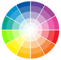
There are three basic colour schemes:
Monochromatic - colours with the same hue but different values (brown and taupe)
Analogous - colours that are next to each other on the wheel and thus similar (green and yellow)
Complementary - colour-wheel opposites that give the most contrast and are exciting to the eye (orange and blue)
Look at the colours in your room and see which ones stimulate your senses in a good way, whether it be a feeling
of calm, contentment, excitement or energy.
Are you ready to fall in love?
If art is very important to you you may consider planning your decor around a newly purchased piece of art.If you are working with a black canvas, excuse the pun, in other words if your house/ apartment has bare plaster or is ready for a total new look then you might want to search for that focal point before you make a start. This way you can really fall in love with a piece of art and build your room around it. Or if you fall in love with an artists style then why not buy several paintings - this will give your whole house a theme that will tie your main rooms together in a similar manner to how hotels use artwork to achieve a certain vibe!
If your newly chosen art can't be your starting point for your decor then simply changing a large item in your room will work, ie you can always replace the accessories in your room and may be changing your rug will help incorporate that special piece.
Colour ideas
To finish this article I want give you a few ideas about colours from my
browse by colour section:
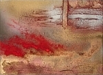
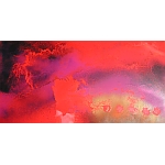
Paint the town red!
The colour red is one of three primary colours and is thought to be the colour to provoke the most response. Red is considered a warm colour along with orange and yellow. The colour red, in all of its various hues, is a very emotionally intense colour, it is a hot, strong colour that depicts emotions such as love, fire, heat, and passion. Red is the colour of fire and blood, so it is associated with energy, excitement and playfulness.
An Accent Colour!
A stimulant, red is the hottest of the warm colours. Studies show that red can have a physical effect, increasing the rate of respiration and raising blood pressure. So maybe a splash of red is all you need! A beautiful red piece of art and a few red accessories maybe all you need to liven up your room. Red ART is the post popular choice!
Using Red
Use the colour red to grab attention, a dash of danger. A little bit of red goes a long way. Small doses can often be more effective than large amounts of this strong colour. Multiple shades of red and even pink or orange can combine for a cheerful and warm palette.
Using Red with Other Colours
Cool blues provide contrast and tone down the heat of red. Light pinks and yellows are harmonising colours that can work well with red if not too close in value such as dark red with a pale or golden yellow. Be careful using purple. It can be an elegant combination but too much could be overpowering.
Different shades of red
Ruby red, also called ruby is a colour that is a representation of the colour of the cut and polished ruby gemstone. Crimson is a strong, bright, deep red colour combined with some blue, resulting in a tiny degree of purple.
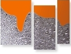
Orange burst!
If you want to get noticed without screaming, consider the colour orange - it demands attention.
Orange is also a very warm colour, so it gives the sensation of heat, nevertheless, orange is not as aggressive as red.
Like red, orange can be utilised as an accent colour and can be used very effectively to highlight certain areas of your room. Use orange as a feature wall to create a focal point, add a purple vase on the table and you have a striking feature. Using colour in small amounts is a good way to introduce strong hues into your home. If you do not want to have a feature wall, a large canvas could be even more striking.
The softer oranges such as peach are even friendlier, more soothing. Peachy oranges are less flamboyant than their redder cousins but still energetic. As a citrus colour, orange is associated with health. Orange is the colour of fall and harvest and can be very affective in a rustic setting used in combination with other ward colours and shades.
Orange is a fantastic colour to use as an accent. Throw around some bright orange cushions to brighten up a dull colour scheme, add some orange flowers to a vase to enliven the room.
Using Orange with Other Colours
Try a dash of orange with deep purple or a dash of purple with a bit of orange, tempered by lots of mellow yellow or white for an eye-catching look that's not overpowering. Orange is the contrasting colour of blue.
As well as brown, burnt orange was very popular in interior design in the 1970s.
Luxurious Purple
combines the stability of blue and the energy of red. Purple is associated with royalty. It symbolises power, nobility, luxury, and ambition. It conveys wealth and extravagance. Light purple is a good choice for a feminine room. Light purple/ lilac also evokes romantic and nostalgic feelings. Even if purple is your favourite, consider using dark purple in moderation as it can evoke gloom and sad feelings. Purple is a lovely, rich colour to use on a canvas and this maybe the ideal way to add this colour to your room with out going over the top!
White
is associated with light, goodness, innocence and purity. It is considered to be the colour of perfection. White is associated with coolness and cleanliness because it's the colour of snow. You can use white to suggest simplicity however it is also associated with sterility, so an off-white shade is often the more appropriate colour choice for interior colour schemes.
White or black and white monochrome artwork can be very striking if a minimal amount of colour, for instance a monochrome background with a splash of colour provides striking focus to the art, drawing your eye to a particular part of the canvas.
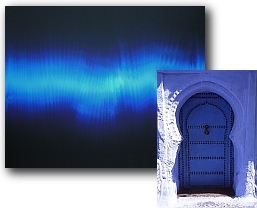
Blue - The men's favourite!
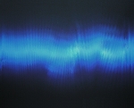
Blue is a masculine colour; according to studies, it is highly accepted among males. Dark blue is associated with depth, expertise, and stability. But blue is not just for the boys and can be used in any room! The timeless colour combination of royal blue and white, which was popularised with the influx of blue and white willow design china plates and crockery, is still as popular today as it was when it was introduced.
Benefits of blue
Blue is considered beneficial to the mind and body, it is strongly associated with tranquillity, calmness and cleanliness. A fantastic alternative to white in bathrooms is soft subtle blues which are basically white with a slight tint of blue. This colour evokes a feeling of openness, calmness and crisp cleanliness to an often small space. It is easy to decorate with and accents of bold colours can be used to create high-impact if required.
An all blue piece of artwork may look quite cold but used in combination with other colours it can be very exciting!